We’re looking forward to welcoming you in to class on Friday (28th November) for our Topic Review. When you come in, we can’t wait to share with you what we have learned about complementary, warm and cool colours.
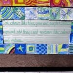
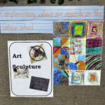
You’ll see some of our work so far on our Art Working Wall. Here is a sneaky peek:

Help at home: Look at these pieces of art shared by the Tate – can you see how the artists have used complementary colours? Tate – Complementary Colours
In class we’ve learned that complementary colours are opposite each other on the colour wheel. This paragraph (taken from the Tate) provides another interesting observation that your child might want to explore.
In colour theory complementary colours appear opposite each other on colour models such as the colour wheel. The colour complement of each primary colour (primaries are red, yellow and blue) can be obtained by mixing the two other primary colours together. So the complementary of red is green (a mix of yellow and blue); the complementary of blue is orange (a mix of red and yellow); and the complementary of yellow is violet (a mix of red and blue).